How to explore the dashboards?
The dashboards have a view screen available to allow to interact with the different dashboards (depending on the user access), as well as update the different data presented using a browser. You can access the dashboard viewer in one of two ways:
Use
There are a few navigation characteristics that we should highlight, for example:
- Browser: by default, at the left of the window, the browser is organized in groups and allows to alternate between the dashboards the user can access;
- Automatic update: the automatic update button (lower right corner) allows to connect and disconnect this mechanism. When it is connected, it activates the dashboards' update with the recurrence defined in the same place (open with the arrow at the right of the button);
- Update now: it is possible to force a dashboard update using this option, available on the automatic update configuration area (arrow at the right of the button);
- Last update: presents the date of the last data update performed by ECHO or by a user. This information is particularly important on the dashboards based on an Extraction Source, considering that those are not updated when opening the view.
Data Presentation Basics
A wide range of dashboard items are used to display visual or textual information.
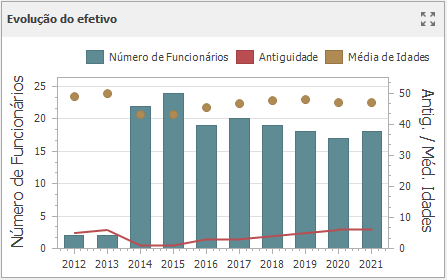
Graph
Displays data graphically using bars, lines, points, etc.
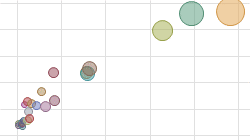
Scatter Plot
Visualizes relationships between numeric variables.
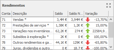
Grid
Presents data in tabular form.
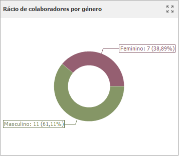
Pie Chart
Displays a series of pies or donuts that represent the contribution of each value to the total.
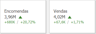
Cards
Displays a series of cards, each illustrating the difference between two values.
Indicators
Visualizes data within a series of gauges.

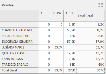
Pivot Tables
Displays cross-tabular reports and allows you to analyze multi-dimensional data.
Choropleth Maps
Colorizes areas in proportion to the provided values.

Geolocated Map Chart
Displays callouts on the map using geographical coordinates.

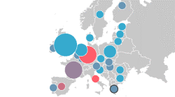
Bubble Chart
Displays bubbles on the map using geographical coordinates.
Pie Chart Map
Places pies on the map using geographical coordinates.

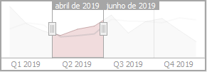
Interval Filters
Allows you to apply filtering by dragging selection thumbs along the argument axis.
Images
Displays images.
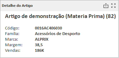
Text Boxes
Displays rich text within a dashboard.
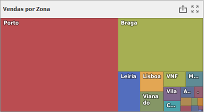
Tree Map
Visualizes data in nested rectangles.
Combo Boxes
Allows you to select a value(s) from the drop-down list.

List Boxes
Allows you to select a value(s) from the list.

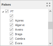
Tree View
Displays values in a hierarchical way and allows you to filter other dashboard items by selecting parent/child values.
Dashboard Layout
This topic describes the features related to the dashboard layout.
Dashboard Title
The Dashboard Title is located at the top of the Dashboard. The dashboard title can contain text or image content, elements selected in the master filter item and command buttons.

When you hover over the filter icon (), all master filters applied to the dashboard are displayed in the invoked popup.
The dashboard title can contain the following command buttons.
- Export To button: allows you to print/export the dashboard. To learn more about printing and exporting, see the Printing and Exporting topic;
- Parameters button: allows you to modify dashboard parameter values. To learn how to modify dashboard parameter values, see the Requesting Parameter Values topic.
Dashboard Item Caption
Each dashboard item has a caption that is displayed at the top of this item. The caption contains static text along with other information, as well as command buttons.
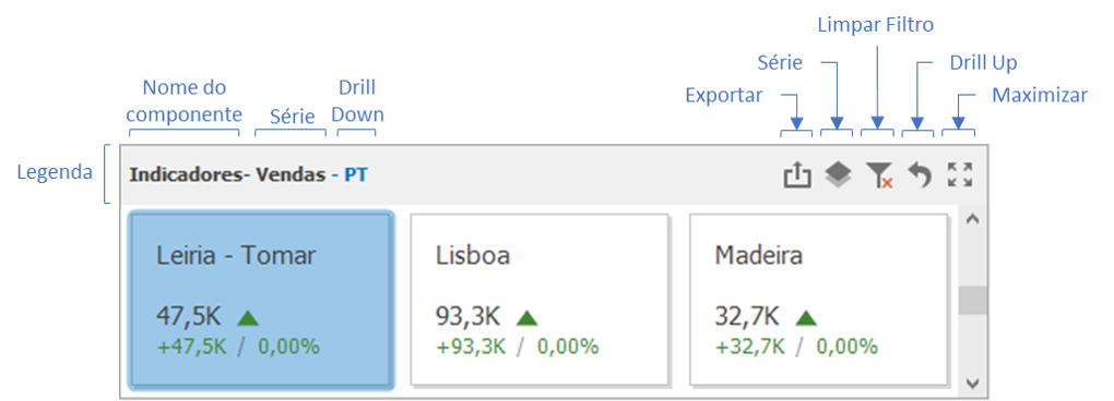
The caption of the Dashboard item contains the following information and buttons, depending on the dashboard item type:
- Dashboard Item Name: represents the static text within a dashboard item's caption;
- Data Item Container Name: represents the name of the data item container;
- Drill-Down value: shows value(s) from the current drill-down hierarchy. To learn more, see the drill-Down topic;
- Export to button: allows you to print or export a dashboard item. To learn how to print individual dashboard items, see the Printing and Exporting topic;
- Values button: invokes a drop-down menu that allows you to switch between provided values (in the pie, card, gauge and map dashboard items). To learn more, see the Data Presentation Basics topic for the corresponding dashboard item;
- Clear Master Filter button: allows you to reset filtering when a dashboard item acts as the Master Filter. To learn more, see the Interactivity topic for the corresponding dashboard item;
- Drill Up button: allows you to return to the previous detail level when the drill-down capability is enabled for this item. To learn more, see the Interactivity topic for the corresponding dashboard item.
Resizing Dashboard Items
The Dashboard Viewer provides the capability to resize dashboard items.

Master Filtering
The Dashboard allows you to use any data-aware dashboard item as a filter for the entire dashboard (Master Filter). You can select elements in a Master Filter item (chart bars, pie segments, grid records, etc.) to filter data in the rest of the dashboard by the selected values.
The Master Filter item supports two selection modes.
Multiple
Allows you to select multiple elements in the Master Filter item. To clear the selection in the Master Filter item, use the Clear Master Filter button in the dashboard item's caption.

Single
Allows you to select only one element in the Master Filter item. When this mode is enabled, the default selection will be set to a Master Filter element. You can change this selection but cannot clear it.
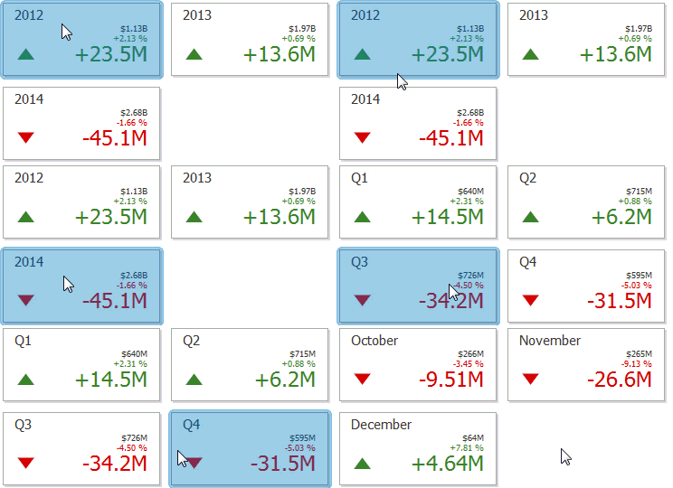
To return to the previous detail level (drill up), use the Drill Up button (the icon) in the dashboard item's caption, or the corresponding command in the context menu.
Dashboard Parameters
The Dashboard Viewer provides a built-in Dashboard Parameters dialog, which allows you to change dashboard parameter values.
This dialog can be used to apply filtering to dashboard data.
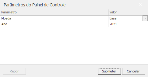
To invoke the Dashboard Parameters dialog in the Dashboard Viewer, click the Parameters button (the icon) in the dashboard title.
Select the required parameter values in the Dashboard Parameters dialog and click the Submit button to apply the changes.
To reset changes to the default values, click the Reset button.
